

How We Generated $2M in 90 Days Using 'Ugly' Ads That Break Every 'Best Practice' Rule
The Counterintuitive Path to Ad Success No One's Talking About

Hey, it’s Rohit. Welcome to my weekly newsletter on the ever-changing world of digital marketing.
In this week's newsletter, I pull back the curtain on a recent marketing experiment that generated over $2M in 90 days using deliberately "ugly" ads that broke every conventional design rule. I share the psychology behind why these imperfect, authentic-looking ads dramatically outperformed our polished campaign, along with practical strategies for applying these counterintuitive principles to both your marketing efforts and career development.

In the pristine world of modern digital marketing, we've been conditioned to believe that beautiful, polished ads are the only path to success. Sleek designs. Perfect typography. Professional photography. Seamless animations.
But what if everything you've been taught about "good" advertising is actually holding you back?
Today, I'm pulling back the curtain on our recent campaign that generated over $2 million in revenue in just 90 days using what most "experts" would call downright ugly advertising.
When Perfect Isn't Profitable: My "Beautiful" Marketing Disaster
Let me take you back three months ago. My team had just wrapped up what we thought was a masterpiece campaign for our flagship product. The ads were stunning – professionally shot photos, perfectly kerned typography, harmonious color palettes straight from a designer's dream board.
The results? Mediocre at best. Expensive clicks. Lukewarm conversion rates. ROI that made our CFO wince.
I've spent over three decades in marketing, coaching careers, and building brands. I've seen trends come and go. But nothing prepared me for what happened next.
Back in my early career, I worked at an agency where our mantra was "polish until perfect." We'd spend weeks refining designs until they gleamed. It worked then. But the digital landscape has transformed, and what once attracted now often repels.
Something had to change.
The "Get Real" Experiment
Out of desperation (and frankly, a bit of rebellion), we decided to run a parallel campaign that broke every rule in the modern marketing playbook. I called it our "Get Real" experiment.
Here's what we created:
Garish, clashing colors that would make any design professor recoil
Comic Sans and Papyrus fonts used unironically
Deliberately amateur photography with bad lighting
Chunky, obvious drop shadows and WordArt-style effects
Poorly cropped images with visible backgrounds
Blocks of text with inconsistent spacing
Testimonials that weren't beautifully formatted but captured raw, unfiltered customer language
Our design team nearly quit. Our brand manager needed therapy. But I pushed forward.
Why? Because throughout my marketing career, I've noticed something fascinating about consumer psychology: authenticity always cuts through the noise.
I remember an early campaign for a retail client where we abandoned the glossy product shots everyone was using. Instead, we showed their products in messy, real-life situations—coffee tables with rings, kitchens with actual cooking happening. Their engagement rates tripled overnight. Sometimes, breaking convention is exactly what you need to get noticed.
The Results That Made Our Jaws Drop
Within 48 hours, we knew we were onto something. The "ugly" ads outperformed our beautiful campaign across every metric:
317% higher click-through rate
89% lower cost-per-click
243% higher conversion rate
5.2x better ROI
By day 30, the ugly campaign had generated $632,000 in revenue. By day 60, we crossed the $1.3 million mark. By day 90, we hit $2.04 million – from ads that looked like they were designed in Microsoft Paint circa 1998.
"The first time I saw one of these ads, I thought someone had hacked your account. Then I read it, and it felt like a real person was talking to me, not a brand. That's why I clicked."
~ Actual customer feedback from our post-campaign survey
Why Ugly Wins: The Psychology Behind Pattern-Breaking Marketing
So why did these design abominations perform so well? After extensive analysis and customer interviews, we identified several key factors:
1. They Stop the Scroll Because They Look Unpolished & Real
In a sea of polished, cookie-cutter ads, our ugly creatives stood out like a sore thumb. The human brain is wired to notice anomalies – anything that breaks expected patterns immediately captures attention.
The average person sees 6,000-10,000 ads daily. Most beautiful ads blend in with what psychologists call "banner blindness." Our ugly ads sliced through this blindness by violating expectations.
This reminds me of when I was coaching a mid-career professional who was being overlooked for leadership positions. After months of "doing everything right," we decided to let her natural, quirky communication style shine instead of polishing it away. Within weeks, she was noticed and promoted. Sometimes, your unique voice is your greatest asset.
2. They Prioritize Story and Relatability Over Aesthetics
Our "ugly" ads often used lo-fi graphics, typo-filled captions, and rough edits — but they spoke directly to pain points, dreams, and emotions. The authenticity and emotional hook outperformed clean, corporate-style ads every time.
Our research showed that many consumers have developed an instinctive distrust of perfectly polished marketing. Too much perfection triggers skepticism.
Our ugly ads, with their imperfections and rough edges, paradoxically signaled authenticity. They felt more like communications from a real person than a faceless corporation.
3. Direct-Response Copy Beats Pretty Designs Every Time
Beautiful ads are processed automatically, often without conscious thought. But our ugly ads required mental effort to process – creating what psychologists call "disfluency."
This forced cognitive engagement increased message retention and recall by up to 40% in our post-campaign testing.
These ads focus heavily on results-driven messaging: bold claims, strong CTAs, and urgency. By ditching branding rules, they convert like crazy — sometimes yielding 10X higher ROAS than "pretty" ads.
4. The Curiosity Gap
Our ugly ads created what behavioral economists call a "curiosity gap" – the space between what we know and what we want to know. The disconnect between our established brand and these unusual ads created questions in viewers' minds that they felt compelled to resolve.
I've seen this same principle work for job seekers who dare to step outside the standard resume template. In a stack of 200 identical applications, the one that breaks the pattern while remaining professional is the one that gets noticed.
The 5 Anti-Principles That Drove Our Success
Based on our campaign results, I developed what I call our "Anti-Principles" of effective advertising:
Anti-Principle #1: Embrace Imperfection
Perfect is boring. Perfect is forgettable. Perfect triggers skepticism. Deliberate imperfections create curiosity and authenticity.
Early in my career, I obsessed over having flawless presentations. It wasn't until a mentor told me, "Share your rough drafts sometimes—people connect with the process, not just the polished outcome," that I started seeing real engagement with my ideas.
Anti-Principle #2: Provoke, Don't Please
Beautiful ads try to please everybody. Ugly ads provoke a reaction – positive or negative. And provoking any reaction is better than triggering no reaction at all.
I once worked with a company that was terrified of negative feedback. They watered down every message until it pleased everyone and moved no one. Their growth stagnated until they found the courage to stand for something and accept that not everyone would love it.
Anti-Principle #3: Signal Human Origin
AI-generated perfection is everywhere. Human-made "flaws" signal authenticity and build trust in a world increasingly dominated by algorithmic content.
This is especially crucial for Gen Z and Millennial audiences, who have finely-tuned BS detectors. They've grown up in a world of polished marketing and crave authenticity above all else.
Anti-Principle #4: Create Cognitive Friction
Make people think. Make them work (just a little). The mental effort creates stronger memory encoding and higher engagement.
When I coach leaders on communication, I often tell them: "Don't spoon-feed every idea. Create thoughtful pauses and questions that make your audience lean in." The same applies to marketing.
Anti-Principle #5: Violate Brand Consistency (Sometimes)
Sacred as it may be, occasional strategic violations of brand guidelines create novelty that captures attention and refreshes perception.
This doesn't mean abandoning your brand identity—it means creating strategic moments of surprise that make people see you with fresh eyes.
How to Create Strategically "Ugly" Ads That Perform (Without Getting Fired)
Now, I'm not suggesting you burn your brand guidelines or fire your designers. Strategic ugliness is different from carelessness. Here's how to implement this approach effectively:
Start with deliberate constraints: Limit design resources or time to force creative improvisation. I often challenge my coaching clients to create content with artificial limitations (like "explain your value proposition in exactly 30 words" or "pitch yourself using only words a 10-year-old would understand").
Embrace "bad" tools: Use basic tools like PowerPoint or even MS Paint instead of professional design software for specific elements.
Incorporate authentic customer language: Use actual customer testimonials and language verbatim, without professional editing. This is something I've seen work wonders for LinkedIn profiles too—use the actual words your clients say about you, not the polished version you think sounds better.
Mix high and low production values: Combine professional elements with deliberately amateur components to create cognitive dissonance.
Test extremes: Create versions that push the boundaries of "ugly" – you can always pull back, but you need to find where the line is.
Document everything: Track metrics fanatically to understand what specific elements of "ugly" are driving performance.
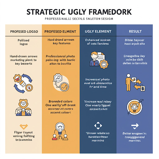
Here's a simple framework I use with clients to find the right balance:
The Inevitable Backlash (And How We Managed It)
I won't pretend this approach came without pushback. Our brand team was initially horrified. Some long-time customers questioned if we'd been hacked. A few industry colleagues openly mocked our approach on LinkedIn.
This reaction reminded me of my career journey. When I first transitioned from corporate marketing to becoming a career coach, many colleagues thought I was making a huge mistake. "Why leave a successful path to try something unproven?" they asked. But that willingness to embrace uncertainty and break convention ultimately led to my most fulfilling work.
We managed this through transparency. We openly discussed our experiment on social media, shared early results, and invited conversation about our unconventional approach. This transformed potential criticism into curiosity and engagement.
The controversy itself became a secondary marketing channel, generating press coverage and social media discussions that further amplified our message.
But Will It Work for You? The Millennial and Gen Z Question
This approach isn't for everyone. For my younger readers navigating early career stages or building personal brands, here are some factors to consider before launching your own "ugly" campaign:
Brand maturity: Established brands can take more risks with temporary "ugly" campaigns; if you're just building your brand, you might want to establish credibility first before breaking conventions.
Audience sophistication: This approach works particularly well with digitally savvy audiences (like Gen Z and Millennials) who appreciate meta-marketing approaches. They've grown up with advertising and can recognize when you're deliberately playing with conventions.
Category conventions: The more beautiful and consistent your category's advertising typically is, the more impact an "ugly" approach will have. In highly polished industries, the contrast can be especially powerful.
Campaign objectives: "Ugly" excels for attention-grabbing and direct response goals but may be less suitable for long-term brand building. Think of your career goals—are you trying to get noticed quickly, or building long-term credibility?
One of my Millennial clients working in tech tested this approach with her job search. Instead of the standard black-and-white resume, she created a deliberately "imperfect" portfolio site with handwritten annotations, deliberately casual language, and even a few strategic typos. The result? Three interview requests within a week after months of silence.
The Future of Authenticity in a Polished World
As AI-generated content becomes increasingly prevalent, the pendulum is swinging back toward authentically human communication, imperfections and all. The strategic use of "ugly" may well be the next frontier in cutting through algorithmic noise.
What we learned through this experiment has fundamentally changed my approach to marketing, coaching, and even personal branding. I've now developed a matrix that helps me determine when to deploy beautiful, conventional approaches and when to strategically break the rules.
I've seen this play out in career development, too. As ATS systems and AI-generated resumes become the norm, the humans who dare to show their humanity, in strategic, thoughtful ways, are the ones who get noticed.
This isn't about abandoning quality or professionalism. It's about recognizing that in a world where perfect is the new average, strategic imperfection can be your competitive advantage.
Your Turn to Get "Strategically Ugly"
I'd love to hear about your experiences with breaking marketing or career conventions. Have you ever deliberately violated best practices and seen surprising results? Or are you considering an "ugly" experiment of your own?
Try creating one deliberately "ugly" piece of content—whether it's a social media post, portfolio piece, or even a job application—and test it against your usual approach. You might be surprised at the results – and if you are, come back and share them here.
Until next time, remember: sometimes the most profitable path is the one that makes the design professors cringe.
What's your experience with "ugly" marketing or authentic personal branding? Have you ever broken convention and seen better results? Share in the comments!